Project 4 Excel Step 3: Add data to your spreadsheet
Our Excel and Statistics experts can help you complete this assignment, 100% original and plagiarism free. Please chat us on WhatsApp +1 (289) 272-2938 or click this ORDER BUTTON to place your order/ get a quote on the 10 strategic/key points for your Project 4 Excel Workbook.
Add Data
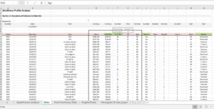
In Section 1 on the Data page, complete each column of the spreadsheet to arrive at the desired calculations. Use Excel formulas to demonstrate that you can perform the calculations in Excel. Remember, a cell address is the combination of a column and a row. For example, C11 refers to Column C, Row 11 in a spreadsheet.
Reminder: Occasionally in Project 4 Excel, you will create an unintentional circular reference. This means that within a formula in a cell, you directly or indirectly referred to (back to) the cell. For example, while entering a formula in A3, you enter =A1+A2+A3. This is not correct and will result in an error. Excel allows you to remove or allow these references.
Hint: Another helpful feature in Excel is Paste Special. Mastering this feature allows you to copy and paste all elements of a cell, or just select elements like the formula, the value or the formatting.
“Names” are a way to define cells and ranges in your spreadsheet and can be used in formulas. For review and refresh, see the resources for Create Complex Formulas and Work with Functions.
Ready to Begin?
- To calculate hourly rate, you will use the annual hourly rate already computed in Excel, which is 2080. This is the number most often used in annual salary calculations based on full time, 40 hours per week, 52 weeks per year. In E11 (or the first cell in the Hrly Rate column), create a formula that calculates the hourly rate for each employee, by referencing the employee’s salary in Column D, divided by the value of annual hours, 2080. To do this, you will create a simple formula: =D11/2080Complete the calculations for the remainder of Column E. If you don’t want to do this cell by cell, you can create a new formula that will let you use that same formula all the way to the end of the column. It would look like this: =$D$11:$D$382/2080
- In Column F, calculate the number of years worked for each employee by creating a formula that incorporates the date in cell F9 and demonstrates your understanding of relative and absolute cells in Excel. For this, you will need a formula that can compute absolute values to determine years of service. You could do this longhand, but it would take you a long time. So, try the YEARFRAC formula, which computes the number of years (and even rounds for you). Once you start the formula in Excel, the element will appear to guide you. You need to know the “ending” date (F9) and the hiring date (B11). The formula looks like this:=YEARFRAC($F$9,B11) and the $ will repeat the formula calculation down the column as before if you grab the edge of the cell and drag it to the bottom of the column.
- To determine if an employee is vested or not In Column I, use an IF statement to flag with a “Yes” any employees who have been employed 10 years or more. Here is how an IF statement works: =IF(X is greater (or less than) Y, “Answer”, IF not, “Answer”). To create this as a formula it would look like this:=IF(F11>=10,”Yes”,”No”)
You can drag this formula down the column or highlight the starting cell, hold down the shift key, and zip down to cell 382 and release and the whole column should compute properly. - Using the VLookup function, use the Region Key located at F417:G420 to fill in the cells in Column N to identify the region in which the employee is located based on the state listed in Column M. (If this function is new to you – hang in there – this one is worth it
Using the VLookup function, use the Region Key located at F417:G420 to fill in the cells in Column N to identify the region in which the employee is located based on the state listed in Column M. (If this function is new to you – hang in there – this one is worth it
There are some video resources available that address some common “hard spots” in this Excel assignment. Do not be confused if you see a data set that is different than yours – the principles are the same! Remember, if you have any questions, ask.

Snip is used by courtesy of Microsoft.
You will devise a formula that will match the state to a region (in position 2). We will use the $ function to enable a repeat of the formula down the column. =VLOOKUP(M11,$F$417:$
Summarize the Data on your Project 4 Excel Workbook
You are now ready to move into Section 2 to prepare the data for future analysis, to include some simple statistical analyses and charts and graphs to present the data. To start, begin by presenting categories of data in summary tables and counting them, totaling them, and calculating percentages. This basic analysis helps you begin to describe patterns in the data and starts to form the story of the workforce.
Complete each table in Section 2. Use the Countif Function to count each item in each table. Use the Sum Function to total the tables when required. Calculate percentages for each table as required. Format cells appropriately. Remember to make smart use of reference cells in formulas (avoid typing in numbers or text into formulas – point to other cells) and use mixed and fixed cell references to make copying formulas easier/faster. Your supervisor will look for this!

Descriptive Statistics – Project 4 Excel Workbook
In this section, you will expand your analysis by employing descriptive statistics or summary statistics to further describe characteristics of the workforce. Your summary table described “how many” and also offered proportions in relation to the entire workforce, but through this analysis, you can describe much more for the following variables: salary, hourly rate, years of service, education, and age.
You will be calculating:
mean, median, mode – average, middle, and most frequent data points in a set.
standard deviation – how spread out individual data points are from the mean. If data points vary greatly, the result is a higher standard deviation and vice versa. It is referred to as a “measure of dispersion” calculated as the square root of the variance. (Note: when calculating manually in Excel, you might see a slight difference between the result you get manually and the result you get using the Analysis Toolpak, depending on whether your version of Excel requires you to use the function DSTDEV or STDEV.S).
variance – the average squared distance between the mean and each data value. It is also a measure of dispersion, which is used to calculate the standard deviation. It is always nonnegative because the calculated squares are positive or zero. A small variance means that the data points are very close to the mean and to each other; thus, a high variance tells us that the data points are very spread out from the mean and from each other.
range – the difference between the highest (MAX) and lowest (MIN) values in a data set.
skewness and kurtosis – numerical measures to describe the shape of a data set and how close it is to a normal distribution. Skewness describes how symmetrical the data is around the mean. Kurtosis describes height and sharpness of the central peak (its peakedness or flatness) in comparison to a normal curve.
Use the Analysis Toolpak on Project 4 Excel Workbook
You have just finished calculating descriptive statistics using individual Excel functions. Did you know that you could generate the same descriptive statistics in one easy step? Excel features an add-in, called the Toolpak, to work with statistics. Try it now.
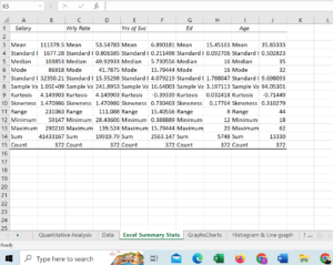
- First, make sure you have enabled the data analysis Toolpak feature. (See the resource below for instructions.) You will calculate the statistics for salary, hourly rate, years of service, education level, and age using the Toolpak function.
- Select the Data Analysis functions at the far right and select Descriptive Statistics.
 Used with permission from Microsoft.
 - Now, you will tell Excel what you want to do and where to look for the data. Since you know that you will use the D – H columns for this operation, you can perform these calculations in one step by highlighting the adjacent five columns of data in D10:H382. That will be the input. You want the output on a new sheet in the workbook.
 Used with permission from Microsoft.
 - When you select OK, Excel will calculate the statistics and put them on a new tab, labeled Sheet 1. (See below.) You will have to “size” the column dimensions, but the work has been done for you.
 Used with permission from Microsoft.
 - Label the tab “Excel Summary Stats.”
- Compare your calculations using the data analysis feature to the results you obtained in the previous step, when you calculated the results manually with individual functions. How did you do?
- Remember the Toolpak. You will use this tool again to create your histogram.
Resources
Work with Data to Create Charts
It is often helpful to view and interpret analytical results when they are presented visually. Graphs and charts help readers digest and interpret information quickly, consistent with the familiar adage “a picture is worth a thousand words.” Let’s Let’s see what we can see in your data analysis in your Project 4 Excel.
Create the following graphs in your Project 4 Excel workbook on a separate tab named Graphs_Charts:
- Create separate pie charts that show percentages of employees by (1) gender, (2) education level, and (3) marital status. Explore pie chart formats.
- Create separate bar charts that show the (1) number of employees by race and (2) the number of employee per state.
- Create a line graph for the sales summary provided.
- Create a histogram that shows the number of employees in incremental salary ranges of $10,000. Here, you want to show how many employees are making $0–$20,000; $20,001–$30,000; $30,001–$40,000; and so forth, up to the highest salary range. This involves counting how many employees are in each “salary bucket” to create a frequency distribution table and histogram. Histograms seem hard, but mastering how to visualize the frequency of events is very helpful for analysis!

Used with permission from Microsoft.
Note: Your Project 4 Excel spreadsheet template has the upper limit and labels already identified. Complete the table and histogram by engaging the Data Analysis Toolpak. Place the output on a new worksheet and label it Histogram.
See below for example of sorted spreadsheet.

Copy the Data so That You Can Learn How to Sort It
Many times we want to sort data on an Excel worksheet for reporting purposes. Let’s see what other perspectives the functions of sorting and subtotaling yield.
- Begin by following the steps in the “How to Copy Excel 2010 Sheet to Another Sheet” provided below. This will allow you to retain your work for Steps 2 through 7. Place the sheet at the end of the workbook and title the tab “Sorted Data.”
- Delete all rows containing Section 2 and Section 3 work. Be sure to leave the section in cells F417:I422, as this section is referenced for the Vlookup function populating the region; otherwise, you will get a #N/A or #REF! Error in the column for region.
- Apply the ability to sort data on each column of the spreadsheet, so that you can sort by employee #, hire date, role, etc.
- Experiment with the filter funnel, sorting the data by various columns. For example, try sorting by employee number from smallest to largest. Try sorting by role in ascending order (A-Z).
- Sort the spreadsheet by region.
- Employ the subtotal feature to subtotal the salary for each region, with a grand total for the company.
- Format the entire spreadsheet to print, so that the columns fit on the pages, and Row 1 repeats on each page.
In this step, your hard work bears fruit by completing your Project 4 Excel Workbook. What does it all mean? Think back to your boss’s reasons for tasking you with this project. Bring your powers of analysis to bear to determine what the data may be telling you. Apply your quantitative reasoning skillsby answering the questions provided in the resource and writing a short essay.
After you answer the questions, your short essay should include:
- a one-paragraph narrative summary of your findings, describing patterns of interest
- an explanation of the potential relevance of such patterns
- a description of how you would investigate further to determine if your results could be perceived as good or bad for the company.
You will prepare your responses in your workbook on the tab named QR Analysis. Type in your answers to the questions as well as the final essay in the textbox, and move the QR tab to the first tab position ( to the left of the Data tab) when you have finished.
Good luck!!
Good job! In the next step, you’ll submit your workbook and analysis.
Step 10: Submit Your Completed Project 4 Excel Workbook and Analysis
You’re now ready to submit your workbook and analysis. Review the requirements for the final deliverable to be sure you have:
- Project 4 Excel Workbook with Six Tabs
- Tab 1: Data—completed data sheet (Steps 1–6 above)
- Tab 2: Summary Stats (Step 6)
- Tab 3: Graphs—Charts (Step 7)
- Tab 4: Histogram (Step 7)
- Tab 5: Sorted Data (Step 8)
Quantitative Analysis (Step 9; see detail below and move to first position upon completion.)
- Answers to Questions and Short Essay
Prepare your response in this workbook. Create a tab for Quantitative Analysis, create a text box, and paste your answers to the questions and your essay in it. Move the Quantitative Analysis tab to the first tab position.
Make sure the following tabs are included in your final workbook:
- Quantitative Analysis
- Data
- Excel Summary Stats
- Graphs–Charts
- Histogram
- Sorted Data
- Format to Be Printed
Format this workbook so that all the spreadsheets can be printed.
Before you submit your assignment, review the competencies below, which your instructor will use to evaluate your work. A good practice would be to use each competency as a self-check to confirm you have incorporated all of them in your work.
- 1.1: Organize document or presentation clearly in a manner that promotes understanding and meets the requirements of the assignment.
- 1.2: Develop coherent paragraphs or points so that each is internally unified and so that each functions as part of the whole document or presentation.
- 1.4: Tailor communications to the audience.
- 1.5: Use sentence structure appropriate to the task, message and audience.
- 1.6: Follow conventions of Standard Written English.
- 3.1: Identify numerical or mathematical information that is relevant in a problem or situation.
- 3.2: Employ mathematical or statistical operations and data analysis techniques to arrive at a correct or optimal solution.
- 3.3: Analyze mathematical or statistical information, or the results of quantitative inquiry and manipulation of data.
- 3.4: Employ software applications and analytic tools to analyze, visualize, and present data to inform decision-making.